Imagine you’re the owner of a store. Like any good shopkeep, you want people to come in and buy your stuff. So, since you are a smarty-pants like Beth Harmon, you come up with a brilliant idea:
Why not pay people to come inside!?
You stand on the sidewalk outside your store (costume optional) and offer passersby a dollar to come inside. They happily take your dollar, step one foot inside your store, then turn around and leave without buying anything.
Sounds like a terrible marketing strategy, doesn’t it? Unfortunately, it’s very common when it comes to pay per click (PPC) advertisements.
Every time a user clicks your ad, you pay.
They take one look at your site and click to a new tab. You’re “PP”ing for lots of C’s, but nobody is converting to sales or taking you up on your incredible offers! All you can do is sit back, throw more money into the void, and watch your cost per acquisition (CPA) skyrocket

Why the heck would users click on your ads if they don’t plan on buying anything? Clearly, something is wrong, but you just can’t put your finger on it.
Maybe your PPC ad isn’t sending users to the right destination…
The Problem: You Send Users to the Mountains, Not the Airport
Many online advertisers link their PPC ads to their website’s homepage.
After all, why wouldn’t you?
Your homepage is beautifully designed and has all the information users could ever want. Even better, it’s already built and requires no additional effort on your part.
The problem is that the homepage has all the information that a prospect could ever want, instead of just the information they are specifically looking for.
Let me explain:
Pretend you’re looking for a vacation destination this summer. You call up a travel agent and say, “I want to do some hiking in the mountains.” The agent does some quick typing and says the taxi will be there to pick you up soon.
With dreams of the Rockies dancing in your head, you excitedly hop in the cab. After a short drive, you arrive at the airport, get out of the cab, and watch it speed off into the distance. So, what now?

In this analogy, you’re the travel agent, your PPC ad is the cab, and the person who clicked the ad is the hiker just looking for some mountains to climb.
Instead of sending them to the mountains (a specific location), you sent them to the airport (your homepage).
Obviously, an airport can get you anywhere you want to go, including the mountains, but it wasn’t the destination the person had in mind. They might wander over to a service desk and get a ticket to Colorado (convert to a sale), but it’s more likely that they’ll call a different travel agent to get exactly where they want to go.
You need to send users to the mountains, not the airport.
Your Homepage is Distracting
While it might be cheap and easy to link your PPC ads to your website’s homepage, your homepage isn’t designed for conversions; it’s designed to provide information.
Your homepage shows off everything your business has to offer. There are links and pictures and tabs and menus and lists and on and on and on. It has everything the user needs to get to their destination, but it’s not the destination itself, just like an airport.
Every piece of navigation is a distraction—a shiny gem that pulls users away from their desired destination. The more distraction there is, the lower your conversion rates will be. This is called attention ratio.
Attention ratio is how many actions a user can take versus the conversion goal.
Your homepage likely has around a 30:1 attention ratio. That means there are 30 shiny gems (links, navigation menus, social media, blogs, etc.) but only one path to a conversion.
With that much distraction, what are the odds they’ll ever make it down that one, lonely path? Spoiler alert: It’s very low.

Ideally, you want the attention ratio to be as close to 1:1 as possible. Point users exactly where they want to go—no distractions, no questions to ask. Send them on a direct flight to the mountains. Every layover is an opportunity for them to wander away.
So, how do you lower your attention ratio to boost PPC conversion rates? With a dedicated landing page!
Create Unique Landing Pages for Each PPC Campaign
Instead of linking users to a confusing, distracting homepage, send them to a dedicated landing page that’s built specifically for the PPC ad.
Landing pages are webpages designed with a specific goal in mind. If you want users to download your new eBook, that’s what the landing page is designed to do. The landing page doesn’t have navigation menus, links, or any other distractions. All the information on the landing page is about the eBook and making it as easy and enticing to download it as possible.
The attention ratio of a landing page is 1:1.
Here are some of the main differences between homepages and landing pages:
|
|
Homepage |
Landing Page |
|
Purpose |
Provide information about your business. |
Deliver content specific to PPC ad. |
|
Visitor Intent |
Broad and generic. They just want to learn. |
Specific. Users know what they want. |
|
Traffic Source |
Anywhere on the internet. |
Specific PPC campaign. |
|
Navigation |
Can take users anywhere they want to go. |
None (at least it shouldn’t for best results). |
|
Content |
Everything there is to know about your business and offerings. |
Only information relevant to the PPC ad offer. |
|
Desired Action |
Provide information about your business, services, and/or products. |
Complete a single call to action. |
As you can see, there are much fewer distractions on a landing page than a general homepage. With a landing page, you’re sending your users straight to the mountains, not the airport!
To help make this real, let’s take a look at some examples.
For example, Love Recon is a client of ours that helps couples refresh, restore, and refocus their marriages to build stronger relationships. Let’s say they wanted to promote their upcoming couples retreat in Houston with a PPC ad campaign.
You—a Houston resident looking for ways to strengthen your marriage—head over to Google and search “couples retreat in Houston, Texas.” Love Recon’s ad pops up. The ad title fits your search exactly, so you click on it and get sent to their homepage:
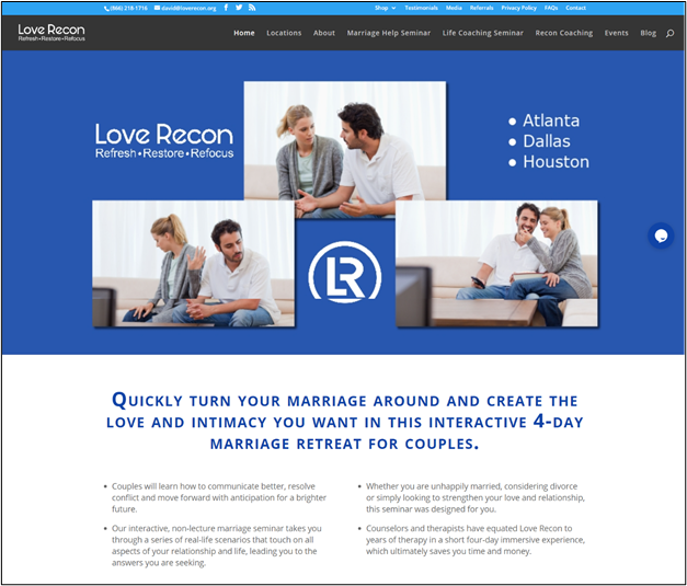
This is a great homepage. It tells you exactly what they do and how they do it. But it’s not specific to the PPC ad.
You were looking for a couples retreat in Houston. This page gives you information about all their locations, the different services they offer, and their business. Just on this simple homepage, there are 23 links all fighting for your attention.
So, where do you go to book a couples retreat in Houston? Not very clear, is it? Chances are good you’ll head back to Google and click on the next ad in the list.
Now, let’s go back in time and pretend they didn’t link the PPC ad to their homepage but instead built a specific landing page for their Houston ad campaign:
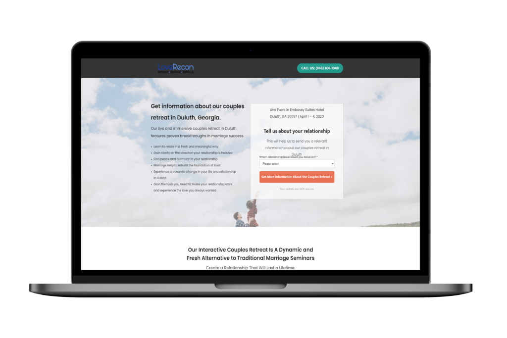
Wow, it’s like being transported straight to the mountains!
This landing page is exactly what you wanted. It tells you all about their couples retreat in Houston and how to get started. There aren’t any navigation menus or links to distract you, and the next step of the process is clear. It has a perfect 1:1 attention ratio.
By linking PPC ads to landing pages instead of their home pages, Love Recon saw their conversion rate increase by 191.75%!
Without the distractions, users have a straight shot to the exact destination they were looking for, leading to more conversions per click.
Create Landing Pages Users Can’t Resist
If you want to maximize your cost per acquisition for your PPC ads, you need to create separate landing pages.
Build each landing page using these four steps:
1. Consider What Your Business Objective
When designing a landing page, the first thing to do is to understand what business action you want the user to take. Do you want them to buy a product, download a content offer, or call your office?
Once you understand the end goal, you can start designing a landing page to suit that purpose—AND THAT PURPOSE ONLY!
Imagine, you just released a new eBook, and you want to promote it with a PPC campaign.
What do you want the user to do? You want them to download the eBook. So, you should create a landing page specifically designed with that goal in mind.
If a user clicks on your ad to download an eBook, they don’t care about your other products or services; that’s not why they’re there. Keep that in mind when designing your landing pages.
Include only content related to the eBook, its benefits, and a single, simple call to action (CTA) that clearly shows users the next step.
Check out this example from one of our client’s – Cloud Medical:
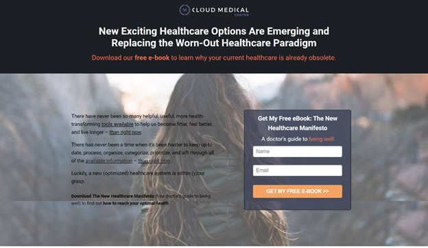
Cloud medical understands precisely what they want users to do. All the information on the landing page is about their eBook and how to download it. There’s not a single piece of content that strays from their PPC ad goals.
Once you have the strategy down, set a business goal that will help you measure success. If your business goal is to generate leads via eBook downloads, it doesn’t really matter how many people visit your landing page or click your ad; it only matters how many downloads you get.
2. Design Unique Landing Pages for Each PPC Campaign
Imagine you run a law firm. You do everything from criminal defense and personal injury to workers’ comp and family law. You want to run PPC campaigns to convince users to speak to your talented attorneys.
You know you shouldn’t link to your homepage (that’s just lazy and won’t lead to many conversions), so you build a landing page. Should you create one landing page for all your PPC campaigns, or should you design individual pages for each campaign?
If you picked the first option, you haven’t been paying attention… You need to design unique pages for each ad campaign!
Consider what users will be searching for and match your PPC landing pages to search queries.
For example, let’s say your law firm wants to run PPC ads for both criminal defense and family law services. They’re very different services and will attract different users online. So, design landing specific landing pages for each.
As an example, with one of our clients Bamieh De Smeth if someone is looking for family law in services in Santa Barbara, they’re going to head over to Google and type in “family law.” The PPC ad pops up, and they click the link:
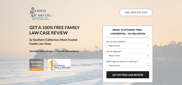
This is exactly the information they want. The keyword that the user typed is included in the title copy, there aren’t any other distractions on the page, and the next steps are clearly laid out with a simple CTA.
Now, imagine if someone looking for criminal defense landed on this page. Would they stick around? Probably not because it has nothing to do with what they want.
Instead, you need another landing page dedicated to criminal defense services. When someone searches “criminal defense,” they’ll be swept away to your other landing page:
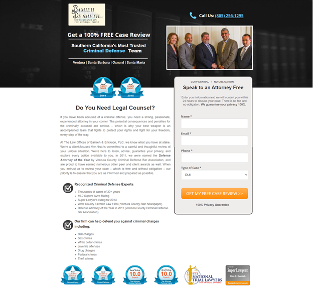
Again, it’s exactly what users are looking for. It discusses only criminal defense services, includes the keyword itself, and provides clear next steps.
Yes, you might have taken some extra time crafting two unique pages, but your conversion rates and CPA will be off the charts!
3. Test Your Landing Pages for Conversions
There are many ways to test a landing page’s “success.” There are plenty of marketers who get excited about ad clicks and pageviews, but is that what’s important? You can have a landing page with thousands of views, but if only two of those users turn into conversions, how successful is your landing page really?
Here’s a hint: It’s not.
You should always optimize for a business metric because you can’t pay the rent in clicks.
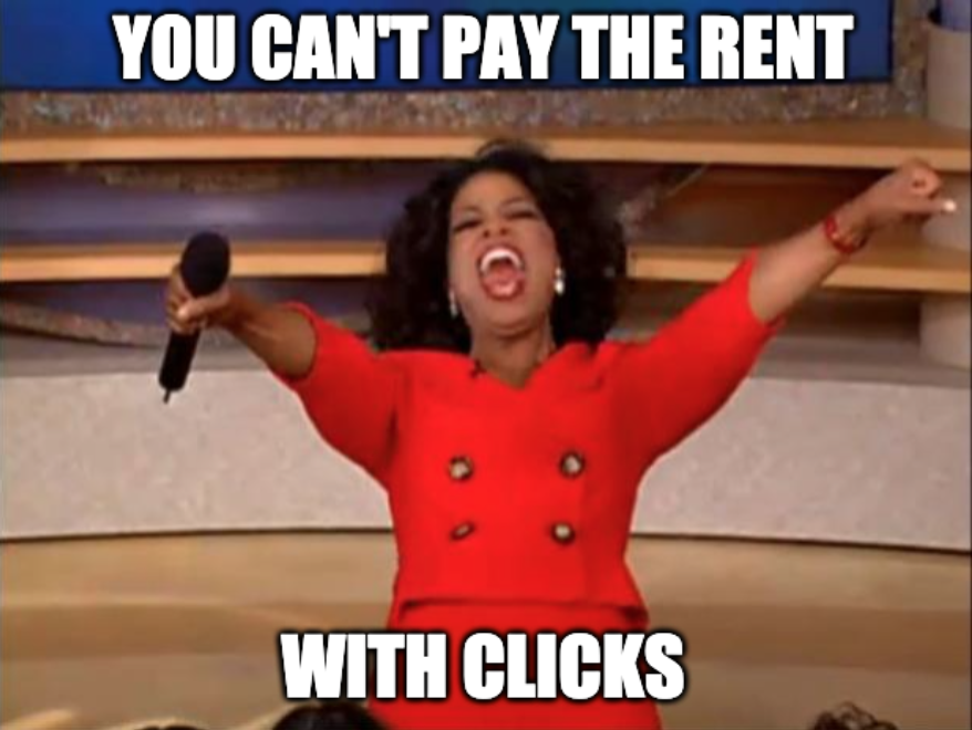
When testing your landing pages, focus on conversion rates. After all, that’s really the only thing that matters.
If you’re not getting conversions, you only focus on vanity metrics and are not running a profitable paid search campaign.
4. Analyze and Optimize
PPC landing pages aren’t something to post and forget about. They need a little babysitting.
Keep an eye on page analytics to see how people interact with your landing pages. This is where you can use some general key performance indicators (KPIs) to get a feel for what’s working and what isn’t:
- Sales – How many people purchased your product.
- Submissions – How many users fill out your submission forms.
- Add to cart– How many users add a product to the cart. This is a sub-KPI is sales are not happening to see where users are stopping.
- Chat – Are users engaged with your chat. Here is an article I wrote about how to use chat to help qualify your leads that was featured in drift.
- Phone calls – Phone calls can be so valuable because you directly speak to the prospect and help them overcome their objections. Here is an article I wrote about optimizing for phone calls that ran in Search Engine Journal.
If you’re not happy with a specific KPI, make some changes to your landing page to try and boost performance. Then, monitor the analytics to see if anything changes. If the performance increases, good work! If not, try something else.
The constant analysis and optimization of your landing pages will ensure they’re performing their best and that you’ll generate the most conversions from your PPC ads.
How Have Landing Pages Benefited Your PPC Campaigns?
Want to generate more conversions from your PPC ads? Stop sending users to your homepage and design unique landing pages for each ad. Only then will you be able to give users exactly what they’re looking for and lead them to the next step in the sales process.
If you send customers to the airport instead of the mountains, they’ll just find another travel agent to get them where they want to go.
How have you used landing pages in your PPC campaigns? I’d love to hear which strategies worked for you—and which ones didn’t! Feel free to leave your comments in the section below.
