So, you’ve beavered away on your new landing page for hours.
Or maybe you’ve spent good money on a seasoned copywriter to do the work for you.
You put the page live, wait for a few days and…
Nada. Nothing. Zilch.
Looking at your analytics confirms that the page has a low conversion rate; visitors lurk for a while, but they just aren’t taking action. You try a little A/B testing, chopping and changing content and headlines, but it doesn’t seem to make much (if any) difference.
Did you really waste all that time and/or money developing a page that’s doing absolutely nothing to help advance users through your sales funnel? Maybe. But, more likely, no.
In fact, the key to improving conversions on your page could be as simple as changing one little word. And it’s a word that a ton of pages based on default landing page templates use as standard.
If you follow this advice, the conversion rate of your pages will be anything but standard.
Why Your Landing Pages Aren’t Converting
When you take a peek at your analytics package for the performance of your landing page(s), it’s rare that the Avg. Session Duration will be anywhere close to zero*. As long as you’re not tricking visitors into checking out your page, and your content is anything approaching decent, people will at least give it a skim.
*An extremely low Avg. Session Duration is an entirely different problem, and necessitates a closer look at your content and/or the search terms you’re targeting.
In other words, it’s unlikely that your content is the biggest problem here.
If visitors to your landing page aren’t converting, it’s much more likely that you’re failing to provide them with the right impetus for continuing their path through your funnel. They bail out and, barring stellar retargeting efforts, you probably won’t see them again.
Here’s the next key question: does your CTA button read Submit? How about Enter? Try? Is it any similar single word along those lines?
If the answer is yes, then we may just have found your problem. Here’s an uninspiring signup form we found that appears to have been pulled straight from a template:
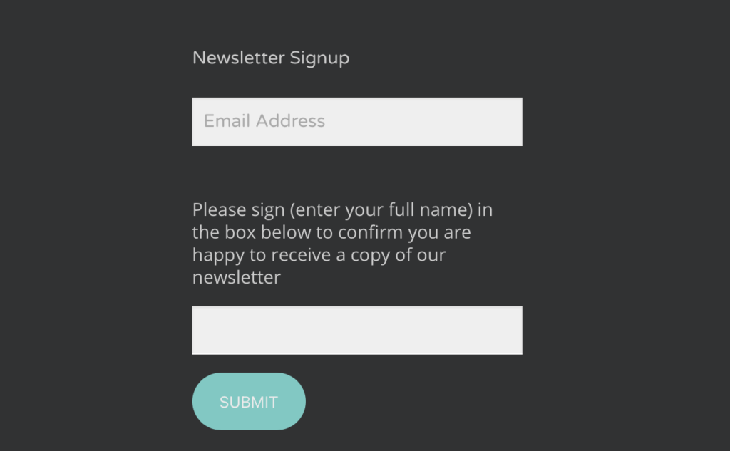
The button, and all the text before it for that matter, really doesn’t tell potential subscribers anything of value about the content of the newsletter or why they might want to receive it.
That is a HUGE problem for conversions.
Your Call To Action Isn’t Compelling Enough
Let’s get psychological for a second. Think about the word Submit. Derived from the word submission, it is by its very nature a passive word. There’s a reason marketers don’t talk about the idea of a CTP, or a Call To Passivity. They talk about a Call To Action, or a CTA.
The idea of submission is very unappealing to readers, even if they only make the connection subconsciously, with few exceptions. Wonder Woman’s indestructible Bracelets of Submission spring to mind…but we’re not in Themyscira anymore, Toto.
Words like Submit, Enter or Try are often used in landing page templates, and many people struggling to create a successful landing page simply leave that text alone. That’s definitely not because they’re lazy. After all, they’ve just written a whole page from scratch!
What templates and landing page creation guides sometimes fail to point out is that this is really just placeholder text that is 100% designed to be replaced with something more compelling. Let’s get into what that might look like.
Demonstrate The Value That YOU Can Add
If non-committal words like Submit and Try are the enemy here, then you might think that words like Create, Experience or Transform are your best friend. And they are…but only to a certain extent.
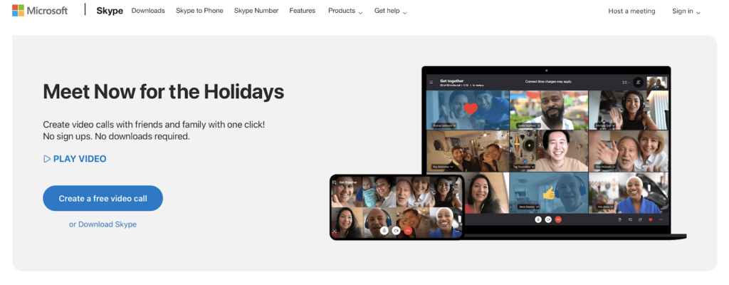
In actual fact, the problem with buttons that invite users to Submit or Try Now isn’t (just) the nature of the words themselves but the lack of motivation behind them. They fail to explain why the user should be excited about taking the next step on this journey.
Even Try For Free is better than Try Now, because it at least explains to potential users that they’re getting something with an implied value for nothing. But it still doesn’t reinforce any of the tangible benefits of clicking the button and moving forward.
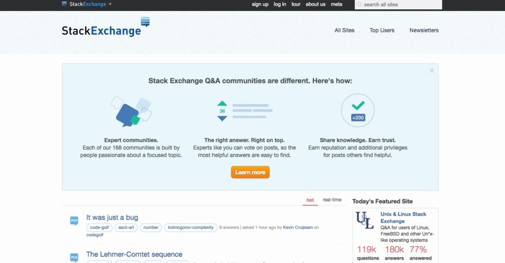
Similarly, phrases like “Learn more” are vague and might not inspire action. However, context is everything. StackExchange just about gets away with using it here because the button is immediately preceded by the sort of content readers can expect if they click:
A landing page with a weak CTA is like a movie or a song that builds up and up and up then, right when you’re expecting a crescendo, you just get sort of a shrug. A powerful CTA encapsulates, in just a few words, all of the reasons a user should be excited.
Before you start crafting your next CTA, take some time to think about the benefits that your service can offer to visitors of that particular landing page. That last part is in bold because it’s important to mix up your CTAs depending on your target audience!
Creating CTAs That Actually Work
Let’s kick this off with a question. If I came up to you on the street with a big red button, said “hey, would you mind pressing this for me?” and nothing else, you’d say no, right?
So why would you expect visitors to your landing page to behave any differently? You need to use your CTA to demonstrate where it’s going to take potential customers next. It’s that simple. Ok, it’s not quite that simple, but it’s our starting point.
Check out this example from one of our clients, Managed Medical Transport, which does just that:
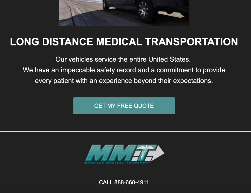
The user is left in absolutely no doubt as to where the button is going to take them; to get their free quote. If the company wanted to get a little flashier, they could try adding something like “no obligation” in there to see if it improves clickthrough rate.
But don’t be afraid to get even more specific than that. This example from our client Renegade.bio gets a little deeper, effectively explaining the entire purpose of their site in a single button:
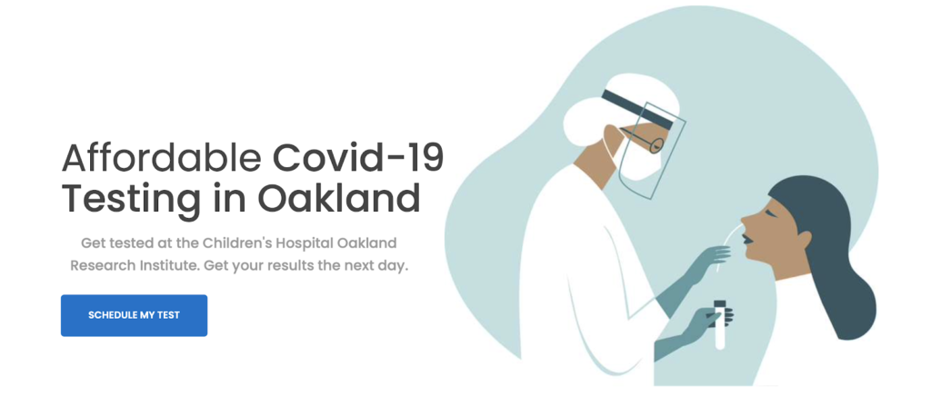
Note the use of the first person to really call out to the user; this isn’t “a” test or “your” test, it’s MY test. With such high demand right now it’s probably difficult to commit to timeframes, but we’d bet that a button like “BOOK MY TEST FOR TOMORROW” or something similar might perform even better.
Some services, like Loom, opt to use a one-two punch of a value proposition complemented by a CTA that offers an additional benefit:
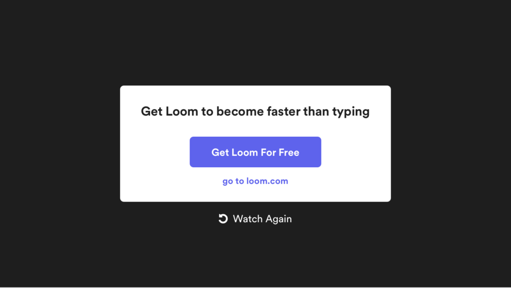
The above could be reworded as “this is going to save you a ton of time. Oh, and btw it’s free too.” There’s such a thing as going overboard, but this is an approach to consider if you’re really struggling to distill your benefit(s) into a single sentence.
Here’s another really nice example of a compelling CTA from FreshBooks:
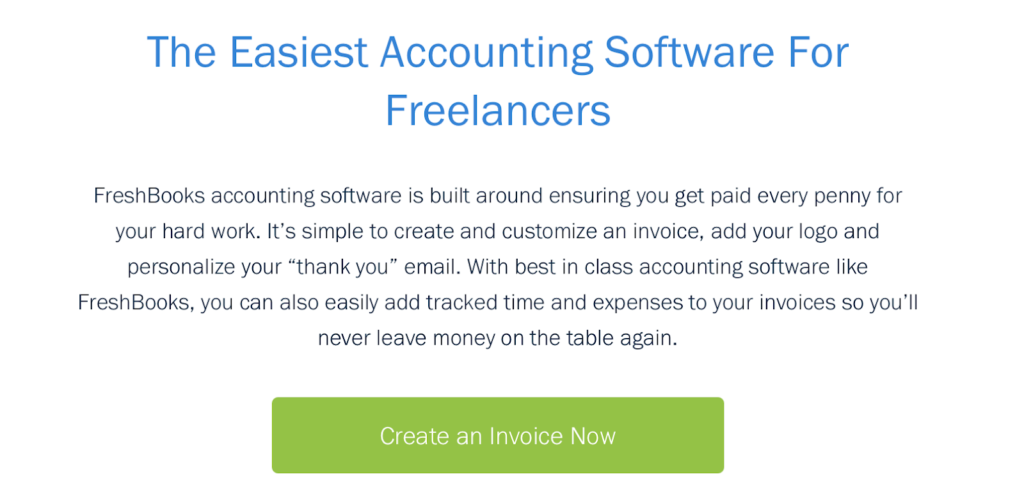
Instead of inviting users to do something vague like “try the software”, it clarifies exactly what you’ll be doing right after you click the button. Plus, it takes advantage of positive association. What typically follows creating an invoice? Getting paid…well, provided you have good clients anyway. And everybody wants to press a button to get paid.
Groucho Marx once said that “I refuse to join any club that would accept me as a member.” It’s a witty expression, but what it’s really getting at is the fact that certain things become less appealing when you feel like they’re too readily available to you.
That’s why services that begin life as a private beta or by invitation only so often experience high levels of demand. If you can find a legitimate way to create an air of exclusivity in your CTAs, that can be a great move:
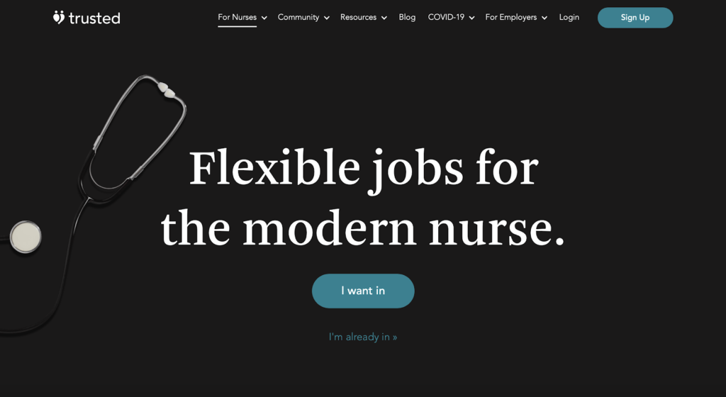
Trusted does this effectively with a button that reads “I want in.” There’s a practical element in play here – the service is only available to registered nurses, so requires manual approval – but it also serves to make it seem sort of like an exclusive club.
There’s no silver bullet when it comes to CTAs; a phrase or idea that works very well for one company won’t necessarily work right off the bat for another. For a long time, many marketers swore by using inequality signs (that’s these guys: < and >) in their CTAs.
There hasn’t been a ton of research into using emojis in CTAs, although there’s evidence to suggest that they improve email open rates, but they’re worth considering for certain audiences. Plus, they help to keep things concise; Neil Patel suggests that the optimal length for a CTA is 10-15 words across a maximum of 1 or 2 sentences.
One thing’s for sure; almost anything you try (as long as you don’t get too crazy) will be an improvement on Submit.


