Want to make killer Facebook ads that people can’t help but click on? Not without using these best practices you won’t!
I know, I know; you’ve seen these “best practices” posts before. But these are honest-to-God, tried-and-true ways to boost your sales and generate all the conversions!
Create the best darn Facebook ads the internet has ever seen with these 17 best practices.
1. Choose ONE Objective that Drives Business Value
The key to any form of marketing is having a clear, precise objective. In the words of the great writer Kurt Vonnegut, “If you open a window and make love to the world, so to speak, your story will get pneumonia.” This is just as true for marketing as it is for writing a story.
Whenever you create a Facebook ad, make sure you have ONE objective in mind. Luckily, the ever-helpful folks at Facebook break down ad objectives into three categories to help you stay on track:
- Awareness – Get your ad in front of as many faces as possible.
- Consideration – Make people think about your business. This includes goals like increase video views, get people to engage with your posts, collect lead information, or visit your website.
- Conversions – Convince people to purchase your products or services.
Since Facebook already knows everything about you, your business, your customers, and, well, everyone, they’ll offer a few specific objective suggestions when you start creating your ad.
The suggestions for one of my pages looks a little something like this:
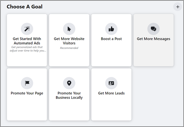
Once you pick a specific objective, everything from your ad copy and images to CTA and even color scheme should work toward this single objective.
If your objective is to increase brand awareness, don’t try to convince people to buy your product. They’re not ready to make a purchase; they just learned about your brand like two seconds ago! You’re “making love to the world,” and your ad will catch pneumonia and die (and Facebook ad funerals are really sad because you wasted a bunch of money).
2. Optimize Ad Placement
Facebook loves placing ads. If there’s an empty space—and sometimes even when there’s not—Facebook will fill it with an ad.
When you’re creating your “best practice” optimized ad, Facebook lets you pick where you want it to show up:
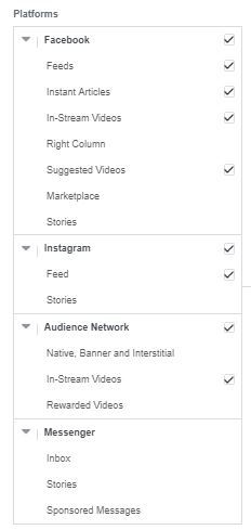
Now, Facebook will tell you that the best place to put your ads is “all of the above.” After all, why wouldn’t you want to get your ads in front of as many people as possible? Well, not all of these placements are ideal for every ad message.
For example, if you’re going for engagements, promoting ads on Audience Network won’t help you achieve your goal. That’ll just put your ad in videos, banners, and apps that partner with Facebook’s marketing platform. How often do people engage with an ad in a video? Never! Because it’s not even an option.
If you’re looking for engagement, stick with placement that actually promotes engagement like Messenger or News Feeds.
Choose an ad placement that actually works with your objectives.
3. Use Facebook’s Campaign Budget Optimization Tool
It might be reasonable to assume that manually keeping track of your budget is better than any automated system that Facebook can come up with, but the Campaign Budget Optimization Tool is actually super helpful (and time saving).
The Campaign Budget Optimization tool lets you set a single, central budget (I want to spend $X every week), and Facebook’s algorithm decides the best way to spend that money to achieve the best results.
Since you already picked your objective in the first stage of the ad creation process, Facebook knows what you want to accomplish and can allocate your budget properly to help you achieve your goals.
You can even use the optimization tool to manage several campaigns from a single budget for even more simplicity.
4. Go Mobile-First with Your Design
Most marketers create Facebook ads on a computer, but most users visit Facebook on their mobile devices. As you might have guessed, ads look very different on a large desktop screen than they do on a tiny phone screen.
Design your ads for mobile first, then alter them for desktop. For obvious reasons, this is called mobile-first design, and it makes a HUGE difference.
But don’t just take my word for it. Check out this example:
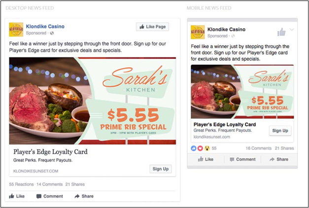
On the big desktop screen, the ad looks great. My mouth is watering just looking at that steak, and I’m ready to jump through the screen for a shot at that stuffed potato! You can even see that the special is available 3 p.m. to 11 p.m. with the player’s card. It has everything you need to want to give that “sign up” button a click.
Unfortunately, most people aren’t going to see the desktop ad.
According to research, 99% of social media users view their news feeds from a mobile device, and 78% use social media exclusively on mobile devices.
That means the grand majority of your audience would see the tiny screen on the right, where you can barely tell there’s even a potato in the background, and the font is too small to read. Is that ad really effective? Not even close.
Make your ads friendly for mobile users with simple graphics, bright visuals, and lots of contrast for the smaller screens first, and worry about the desktop version later.
5. Create Ads Specifically for Your Audience
To create an effective ad that captures leads and makes sales, it needs to be relevant to your audience. That’s marketing rule number one!
As you craft your ad, keep your audience in mind. Think of demographics like:
- Age
- Gender
- Location
- Interests
The more your ads cater to your specific demographic, the more likely they’ll be to convert.
Sending the juicy steak ad from the example above to vegetarians probably wouldn’t result in many sales. But if you catered that ad to men ages 25-45 (you know, before the high blood pressure sinks in), you’ll get a lot more hits.
6. Understand the Difference Between Broad and Specific Targeting—And When to Use Each
After reading the last best practice tip, this might get a little tricky. Facebook lets you choose your target audience when creating ads. So, wouldn’t it make sense to get as specific as possible? As it turns out, that might not always be the case.
According to Social Media Today (who has partners at Facebook), being super specific with your ad targeting can actually be more expensive and limit your ad’s effectiveness.
When you choose a highly specific audience, you’re battling other companies for that small group. The more competition you face, the higher your cost per acquisition will be, and the fewer people who will see your ad.
So what if it’s more expensive? I’m still reaching my target audience, right?
In traditional marketing, you’d be right. But with Facebook, you have powerful algorithms working to optimize your ads. The more information they can gather, the more optimized your ads will be.
Choosing a super specific audience doesn’t give Facebook many touchpoints to learn from. Targeting a somewhat broader audience will give Facebook the information it needs to optimize your ads and send it to the people who are most likely to take your desired action based on your objective.
For example, if your target audience is men ages 25-45, maybe extend your reach to ages 18-55. You might have gotten a bit less specific, but you also gave Facebook a few more data points to learn from to better optimize your ads.
7. Make Your Ads Relevant to the Audience
This best practice goes beyond just targeting a specific audience. You should also make the ad relevant to all their wildest wants, needs, and desires! As difficult as it may seem, the goal is to make users enjoy your ads.
Obviously if a user likes an ad, they’re going to be more likely to give it a click. But relevance goes well beyond just good marketing practices; it’ll affect both the cost and visibility of your ad!
Facebook uses something called Ad Relevance Diagnostics. Basically, they rank ads based on relevance to the user based on three diagnostics:
Basically, the better your ad performs and the higher level of quality it’s perceived to have, the cheaper and more visible it’ll be on Facebook. It’s like getting a piece of candy for doing a good job!
What that means for you is you can’t just write a bunch of marketing mumbo-jumbo, press upload, and expect it to do well. You need to really think about your audience and create ads they want to see.
8. Use Appealing Images
When it comes to Facebook ads, images are your best friend. No matter what you promote or where you post, always include a high-quality image.
Images are good for three reasons:
- Images get the most shares on social media.
- Pictures capture users’ attention better than text-only posts.
- They’re favored by the Facebook algorithm.
Before you go searching through your pictures file on the computer for some random images to shove into your ads, note the words “appealing” and “high-quality.” Not all images are created equal.
So, what counts as an appealing image?
- Related to the product or service (which we’ll touch on later)
- Bright and eye-catching
- Doesn’t contain any small details that would be hard to see on a mobile device
Not into lists? That’s okay. Check out this example from AirAsia:
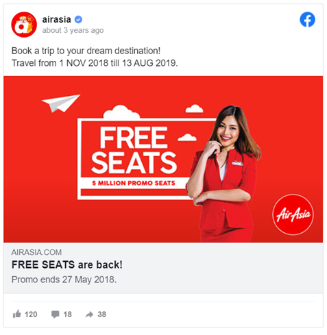
See how it checks all the boxes? The image is simple, related to the service, would be easy to see on mobile, and bright enough you wouldn’t be able to miss it (especially on a blue Facebook page).
9. Harness the Power of Video
What’s better than a picture? How about thousands of pictures flashed before your eyes at dozens of frames per second? Yes, I’m talking about video.
Adding video to your Facebook ads might take a little extra effort, but there’s no doubt it’s a powerful addition to any marketing campaign.
Videos can capture user attention much faster than a picture alone. And, if you make your video engaging enough, users will watch your videos for longer so you can give them more information about your products, services, or business.
Sephora, the makeup retailer, decided they wanted to spruce up their Facebook ad campaign for the holiday season. They swapped their “boring” old static Facebook ads with fun, engaging videos:
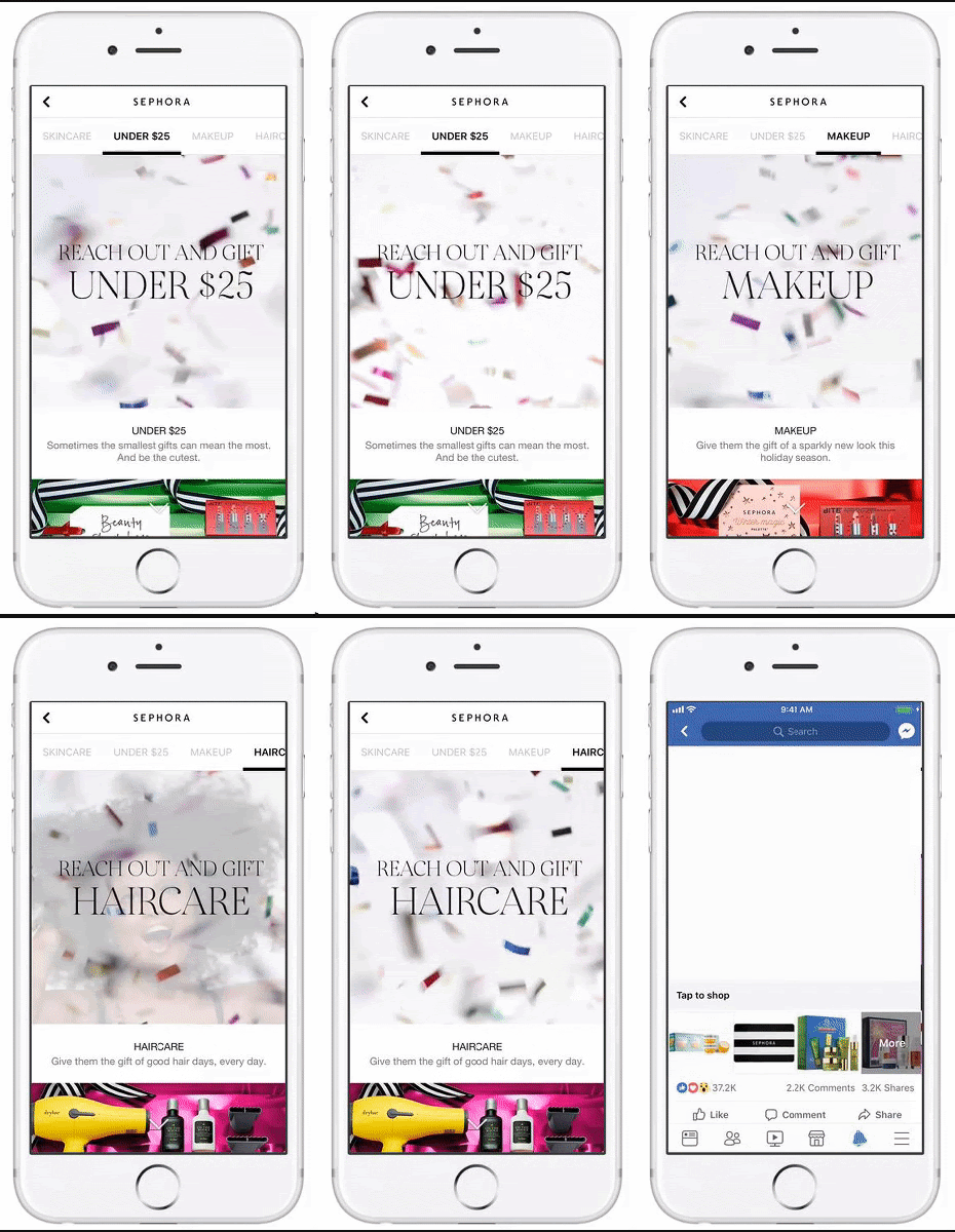
What do you think happened? Their click through rates increased by 41% and their return on each ad spent went up 32%!
Videos are great at capturing users’ attention and convincing them to take the suggested action.
10. Use Vertical Video Orientation
People usually hold their phones vertically. I mean, if you saw someone scrolling through social media holding their phone horizontally, you’d probably think something was wrong with them. So, if you know that’s how most people hold their phones, your content should reflect that.
Whenever you add videos to your Facebook ads, make sure they have a vertical orientation so they cover more of the users’ screen. That’s an easy way to boost your video’s attention-grabbing power and make it easier for users to watch your awesome content.
One video marketing agency decided to get to the bottom of the conundrum and used the same video for two Facebook ads with identical budgets. The only difference was the orientation.
Surprisingly, the ad with the vertical video reached 58% more people. Since both ads had the same budget, the horizontal ad cost 63.5% more per impression compared to the vertical video.
As it turns out, people don’t like to flip their phones sideways. If you use video in your Facebook ads, use a square or vertical orientation to make the most of your ad dollars.
11. Make Sure Ad Visuals Are Aligned with the Copy
No matter which visual format you choose—whether it’s images or video—your visuals need to make sense with the rest of the ad.
It doesn’t matter if Van Goh himself painted your Facebook ad image, if it doesn’t make sense with the rest of the ad, it’s just going to confuse people and they’ll scroll on past without taking any action.
Check out this example of a poor visual/ad match.
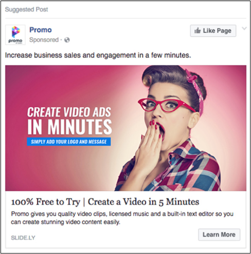
They nailed it on the eye-catching and mobile-optimized requirements, but what does a woman yawning(?) have to do with making better video ads? Plus, it’s not even a video!
Now take a look at this ad:
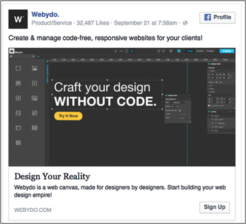
It might not be the most colorful ad, but the black stands out well against the white Facebook background, and the image is clean, relevant, and it fits perfectly with the ad copy. You know exactly what’s being advertised without even looking at the copy. But when you do, they’re perfectly aligned.
12. Write Better Copy…
Speaking of copy, that needs to be great too! The visual element is supposed to attract users’ attention, but the copy is what brings them in.
Think of it like a fishing rod. The image is the bait, and the hook is the amazing copy that follows. Then, all you need to do is reel them in.
There are three ways you can “hook” users with your copy:
- Persuade
- Excite
- Entertain
The best Facebook ads will include a little bit of all three. It’ll help you form a connection with your audience and increase the likelihood that they’ll do what you want: turn into a sale or conversion.
Take a look at this example from Twice:
Not only does the image match the copy, but the copy is also quite persuasive by itself. The idea that you could earn some extra money for your stuff is exciting (and they had an exclamation point!) and “be kind to your wallet” is persuasive.
They hit two of the three boxes for some awesome Facebook ad copy.
13. …But Not Too Much Copy
Even if you consider yourself to be the next Hemingway, don’t put too much copy into your Facebook ads.
People scrolling through their newsfeeds aren’t interested in reading a novel; they want short, sweet text they can scan quickly and keep moving. If you put too much copy in your Facebook ads, you’ll scare everyone off!
The folks over at AdEspresso clearly had nothing better to do, so they sat down and analyzed 752,626 Facebook ads to determine the ideal word count for each section. Want to know what they found?
- Headline: 5 words
- Body text: 14 words
- Link descriptions: 18 words
It doesn’t matter how good the copy is. If you include too much, people are going to see the giant wall of text and keep on scrolling.
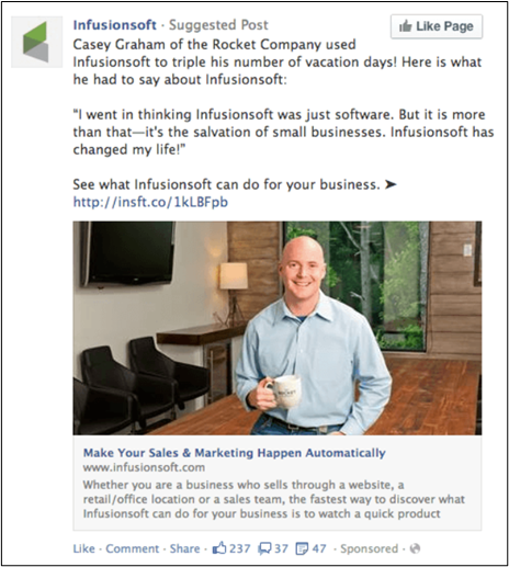
Take a look at this Facebook ad from Infusionsoft:

The copy is fine, and I’m sure the case study is spectacular, but there’s just too much of it. If you have to space down a few lines to make a new paragraph, you’ve done something wrong.
Make your Facebook ad social media-friendly by keeping copy short, sweet, and concise.
14. Draw Them in with a Killer Value Proposition
Why on earth would anyone want to click your ad? Don’t leave it up to the users to guess the answer; tell them straight up with an awesome value proposition.
A value proposition tells users why they should click your ad. What makes you unique? How can you solve their problems? What value can you add to their lives?
Answering these questions in your Facebook ad will entice people to take the next step—whether it’s filling out a form, visiting your website, or buying a product.
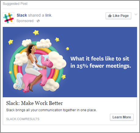
Check out this awesome value proposition from Slack:
Why click on their ad? Because if you do, you won’t have to sit in as many meetings. And that’s something everyone can get behind! They even throw in a percentage to add to the credibility and persuasiveness of their ad.
You can clearly see the value of taking the next step. Go ahead and give that “learn more” button a click.
Speaking of the “learn more” button…
15. Include a Clear Call to Action
What do you want users to do next? They’re not going to stumble their way to the answer themselves; you have to tell them with a clear call to action (CTA).
A call to action is literally exactly as it sounds: You’re calling users take action. Whether you want them to send you a message, buy a product, or download an ebook, the CTA is what asks users to do it!
Of course, it always helps to throw in a little “sumthin sumthin” to sweeten the deal. Many CTAs include offers like “try for free” or “take an extra X% off your order” to entice users to click the deal. These types of phrases also add a level of urgency to your Facebook ad, making it even more irresistible!
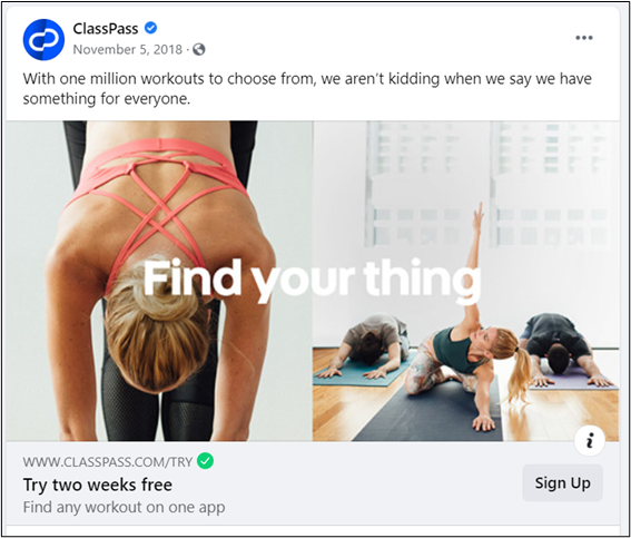
Take a look at this ad from ClassPass for a prime CTA example:
While there’s not much copy on this Facebook ad, it has a great CTA. If you take the action, you’ll get two weeks of workouts for free. Then, once you’re all enticed by the sweet offer, there’s an easy little “sign up” button right there in the corner to show you the way.
Facebook makes CTAs even easier by offering a wide variety of buttons to choose from to support your unique offer. You can make it say things like “learn more,” “contact us,” or “book now” to align with your unique call to action.
16. Keep an Eye on Your Ad Performance
Facebook advertising isn’t like the marketing of yore. You don’t just submit an ad to the local TV station and hope it’ll attract some customers.
Now, there are analytics upon analytics for you to look at, so you know exactly what works and what doesn’t work. Once your ad is live, keep an eye on its performance using Facebook analytics.
If you notice it’s not doing as well as you hoped, make a few changes and try again. Still didn’t work? Change something else and see what happens.
For example, if you notice your ad isn’t getting many clicks, your CTA might not be too weak. Add some stronger wording or a special offer and see if you can’t get the numbers to climb.
Facebook ads are a dynamic, trial-and-error process. Keep a close eye on your ad performance to make sure they’re living up to your expectations. Don’t forget to keep notes about what you learn! You can use them for future campaigns.
17. Optimize Your Budget (and Keep an Eye on That Too)
Facebook advertising is great for any business because it lets you choose your own budget. If you want to spend only $5 per month, go for it! You can still see huge results on a small budget—as long as you pay attention.
The cost of Facebook advertising varies depending on things like the audience size, niche, and competition. If you create an ad that’s relevant to customers and better than the competition, you’re going to see results despite having a smaller budget.
If you’re just starting out with Facebook ads, start small. Choose a low budget and get a feel for what works and what doesn’t work. When you find that recipe for a perfect Facebook ad (and use all the best practices, of course) crank up the budget and watch the sales and leads pour in.
If you run campaigns with multiple ads, keep an eye on the performance and set your budget accordingly. Boost funding for high-performing ads and reduce it for ads that don’t live up to your expectations. That’s the best way to get the most bang for your marketing buck.
What Have You Learned from Facebook Advertising?
Now that you know how to craft the ultimate Facebook ad to generate more leads and sales, you’re ready to take on the marketing world. You know, once your eyes recover from reading so many best practices!
There are tons and tons of ways to boost your Facebook ads. Some of which might not have even been discovered yet!
If you’ve found a “best practice” that works for you, I’d love to hear about it. Shoot me a comment below and get the conversation started!

